

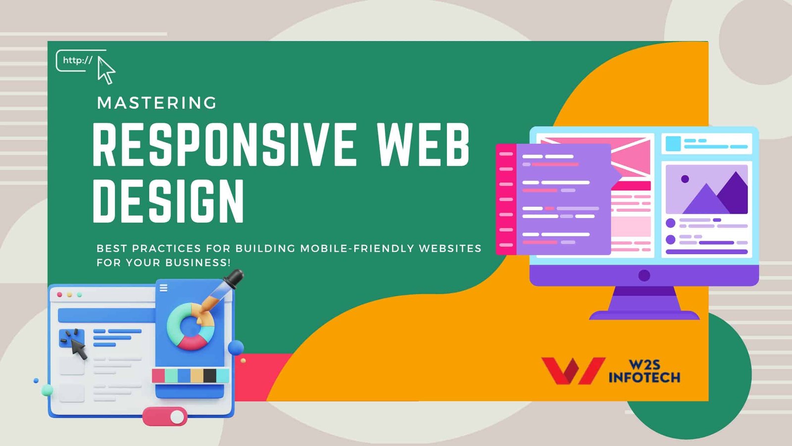
Mastering Responsive Web Design: Best Practices for Building Mobile-Friendly Websites
In the digital era, having a website that adapts seamlessly to different screen sizes is crucial for business success. Responsive Web Design ensures that websites function optimally on desktops, tablets, and mobile devices, providing users with a smooth and engaging experience. Businesses that ignore this critical aspect often lose customers due to poor website usability.
At W2S Infotech, we prioritize implementing the best practices for web design to create seamless, user-friendly, and high-performing websites. If you’re looking for the best website designing in Meerut, this guide will provide you with everything you need to know about mastering Responsive Web Design and its best practices.
What is Responsive Web Design?
Responsive Web Design (RWD) is a web development approach that enables a website to adapt to various devices and screen sizes automatically. Whether a visitor is using a smartphone, tablet, laptop, or desktop, an RWD-based site ensures a smooth browsing experience without compromising functionality or design.
With more than half of global web traffic coming from mobile devices, Responsive Web Design is not just a trend but a necessity. W2S Infotech specializes in creating highly adaptable websites by following the best industry practices.
Why is Responsive Web Design Important?
- Better User Experience – Users prefer a seamless and hassle-free browsing experience. A responsive site ensures that all elements are easily accessible, regardless of the device.
- SEO Benefits – Search engines like Google prioritize mobile-friendly websites. Implementing Responsive Web Design improves search rankings.
- Increased Mobile Traffic – With the growing dominance of mobile users, businesses must cater to a mobile-first audience.
- Cost-Effective – Instead of maintaining multiple versions of a site (desktop and mobile), a responsive site reduces costs by working universally.
- Higher Conversion Rates – A smooth user experience leads to better engagement and increased conversions.
Best Practices for Mastering Responsive Web Design
Implement a Fluid Grid System
A fluid grid system is the foundation of Responsive Web Design. Instead of using fixed pixels, designers use proportional values (percentages, ems, or rems) to structure web layouts. This flexibility allows the website to adjust its proportions dynamically based on the screen size.
How W2S Infotech Implements Fluid Grids?
- We use CSS frameworks like Bootstrap to create flexible and scalable grid layouts.
- By defining relative widths, our web designs adjust seamlessly to any device.
Optimize Images for Responsiveness
Images play a vital role in web design but can impact performance if not optimized. The use of responsive images ensures they scale properly without distorting or slowing down the website.
Image Optimization Techniques:
- Use CSS properties like
max-width: 100%to ensure images fit their containers. - Implement modern image formats like WebP for faster loading.
- Utilize lazy loading to defer the loading of offscreen images.
W2S Infotech uses the best practices for web design, ensuring optimized images for improved performance.
Use Flexible Typography
Just like images, text should adapt to different screen sizes. Fixed font sizes may appear too small on mobile screens or too large on desktops.
Best Practices for Flexible Typography:
- Use relative units like
emorreminstead of fixed pixels. - Implement
vhandvwunits for scaling text based on the viewport. - Utilize CSS media queries to define typography breakpoints.
Prioritize Mobile-First Design
A mobile-first approach involves designing a website for mobile screens before scaling up for larger devices. This ensures that critical features and content remain accessible and user-friendly.
How W2S Infotech Implements Mobile-First Design?
- We design and test mobile layouts first, then expand for desktops.
- We optimize touch interactions and ensure smooth scrolling.
Utilize CSS Media Queries
Media queries allow developers to define styles that apply based on the device’s screen size. This technique ensures that layouts adjust dynamically.
Example of CSS Media Query:
@media screen and (max-width: 768px) {
body {
font-size: 14px;
}
}
Enhance Website Navigation
A well-structured navigation system improves user experience. Responsive menus should adjust based on the device.
Responsive Navigation Techniques:
- Use collapsible menus (hamburger menus) for mobile screens.
- Implement sticky headers to maintain easy access to navigation options.
W2S Infotech uses the best practices for web design to create intuitive navigation structures.
Optimize Website Speed
A slow-loading website can frustrate users and lead to high bounce rates. Performance optimization is a crucial part of Responsive Web Design.
Speed Optimization Techniques:
- Minify CSS, JavaScript, and HTML.
- Use Content Delivery Networks (CDN) to distribute assets.
- Optimize caching strategies to load content faster.
For businesses looking for the best website designing in Meerut, W2S Infotech ensures optimal performance across all devices.
The Future of Responsive Web Design
The web design landscape continues to evolve, and Responsive Web Design will remain a core focus for businesses. Technologies like AI-driven design adaptation and advanced CSS frameworks will further enhance responsiveness.
Why Choose W2S Infotech?
At W2S Infotech, we specialize in crafting Responsive Web Design solutions that cater to businesses of all sizes. We integrate the latest web technologies to ensure your website is future-proof and user-friendly.
If you’re searching for the best website designing in Meerut, our team is ready to deliver top-notch services that align with industry standards.
Conclusion
A well-executed Responsive Web Design ensures a smooth user experience, enhances search rankings, and drives higher engagement rates. By implementing best practices such as fluid grids, flexible typography, and optimized navigation, businesses can create websites that stand out in today’s competitive digital space.
At W2S Infotech, we prioritize using the best practices for web design, ensuring your website is optimized for all devices. Whether you’re a startup or an established business, having a mobile-friendly website is essential for success.
If you’re looking for expert web design solutions, get in touch with W2S Infotech, the best website designing in Meerut, and take your business to the next level!